A Sofa Is Not a Palette: Choose Room Colours from Real Use
A room palette is often built around the newest or most expensive item, especially a sofa. That approach feels logical, but it gives one object too much authority. The room also contains daylight, flooring, timber, views, habits, dirt, food, books, and changing textiles. A useful palette responds to this whole system.
Start by observing the room before collecting inspiration images. Colour is not a set of isolated swatches. It is a proportion of surfaces seen under specific light during real activities.
Record the fixed colours first
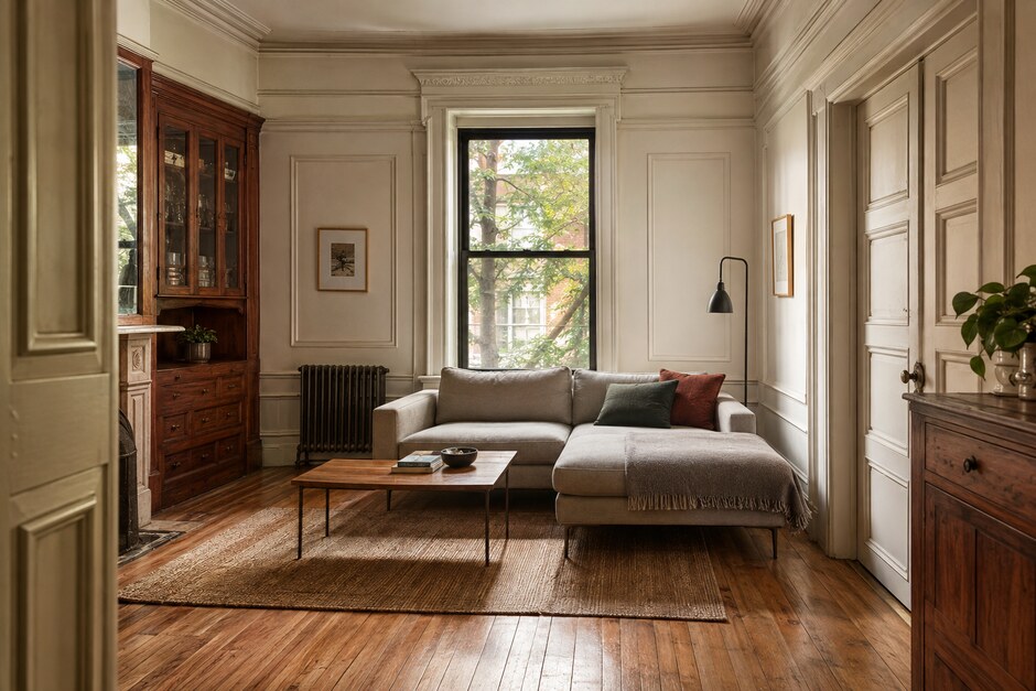
List the elements that are expensive or impractical to change: flooring, stone, tile, built-in cabinetry, window frames, and a major piece of furniture that will remain. Describe their undertones in comparison with plain white paper. Timber may read yellow, red, gray, or green depending on its finish and surrounding light.
Do not force every fixed element to match. Decide which one should be supported, which can remain neutral, and which contrast is worth keeping.
Observe daylight at three times
Photograph the room in the morning, afternoon, and evening without filters. Notice where cool sky light enters, where direct sun warms a wall, and which corners lose colour after sunset. A paint chip judged beside a bright window may look entirely different on the opposite wall.
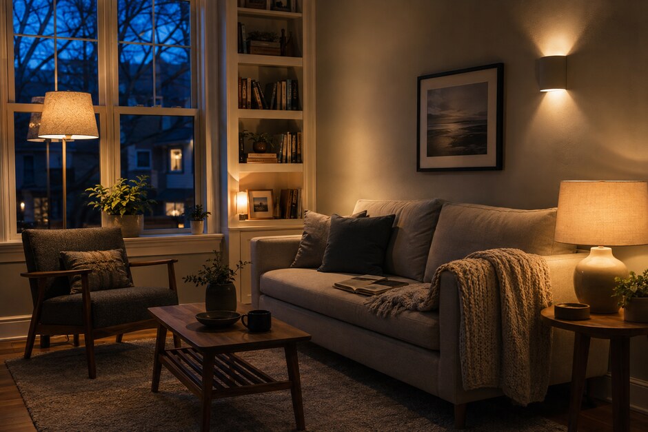
If most living happens at night, test the palette under the actual lamps as carefully as in daylight. The most flattering noon colour is not necessarily the most comfortable evening colour.
Let activity influence the palette
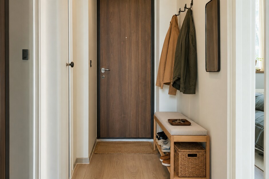
A room used for energetic family meals can tolerate stronger contrast than a room used mainly for reading and rest. A busy entrance benefits from forgiving mid-tones and materials that age well. A workspace may need enough tonal difference to keep tools and papers visible.
Colour should support the desired level of stimulation. This is more precise than choosing a generic mood such as calm or bold.
Build proportions, not a row of equals
Select one dominant background family, one supporting material or colour, and one limited accent. Write a ratio such as 70/25/5. The exact numbers are flexible, but the hierarchy prevents every colour from appearing in equal amounts.
The sofa can belong to the dominant or supporting group without defining the entire scheme. Repeat its undertone through one or two smaller materials rather than matching cushions, curtains, walls, and art to the upholstery.
Test real materials together
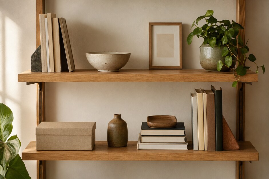
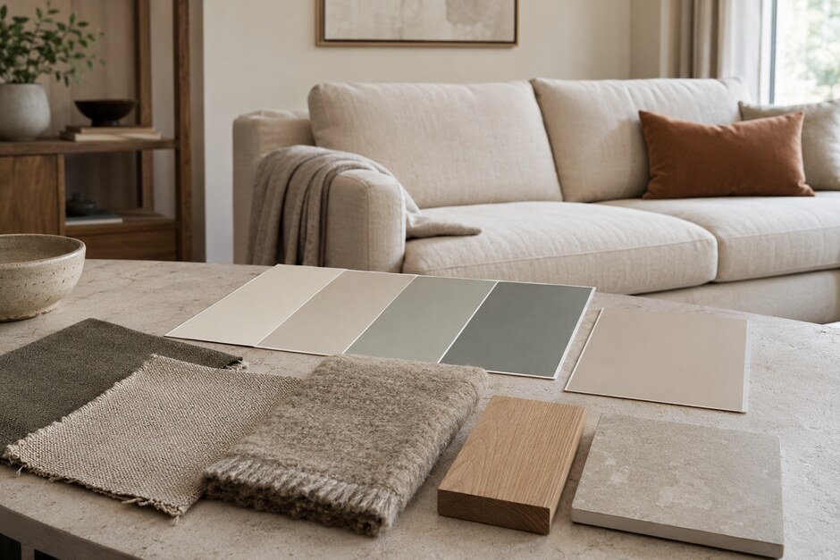
Place large paint samples beside actual timber, fabric, metal, and tile. Texture changes colour: looped wool creates shadows, linen scatters light, and gloss reflects surrounding hues. Screen images and tiny fan-deck chips cannot represent these interactions reliably.
Move the sample group around the room. View it near the floor, behind the sofa, and in the darkest corner. The palette should stay related even when individual colours shift.
Use full-size paint samples
Paint movable boards or large sheets with the intended number of coats. Tape them to different walls and keep them up for several days. A small brush mark can exaggerate the contrast with the old wall and lead to a poor decision.
Check transitions through doorways. A room is rarely seen in isolation; the adjacent hall or kitchen becomes part of its colour field.
Allow the palette to change by season
Keep fixed surfaces broad and durable, then use smaller textiles and objects for seasonal shifts. A muted base can support a warm rust accent in winter and a faded green in summer without repainting the room.
The final test is not whether every object matches. Ask whether the important materials look intentional together, whether the room works in its most-used light, and whether future objects have somewhere to belong. A resilient palette is a framework for daily life, not a colour sample attached to one sofa.